
LARGE PARAGRAPH TEXT FOR LONGER DESCRIPTIONS
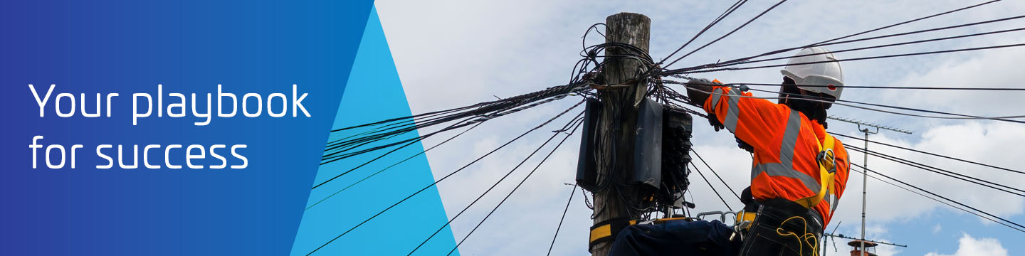
With FTTH rollouts rapidly accelerating in Europe, various challenges are emerging that have the potential to make fibre slow and expensive to deploy while threatening network reliability and longevity. These factors include skilled labour shortages, lengthy permitting processes, and the unique dynamics of Europe’s façade, underground, aerial, and central office environments. Two of the top concerns are cabling messes and terminal boxes that are no longer able to close, which are the result of rapid network growth and the lack of quality products and skilled labour used in fibre deployment.
This white paper examines these challenges and presents a range of connectivity solutions and techniques that can help service providers accelerate fibre deployment, reduce capital costs, and improve network reliability across a range of infrastructure types and deployment locations.
Large Paragraph Text Used As A Subheading
Lorem ipsum dolor sit amet, consectetuer adipiscing elit, sed diam nonummy nibh laoreet volutpat.
— John Doe | Job Title, Company
Pellentesque non magna eget ex lobortis finibus. Lorem ipsum dolor sit amet, consectetur adipiscing elit. Etiam nec arcu non eros hendrerit viverra a vitae libero. Etiam et ultricies nulla. Donec euismod lectus magna, eu dignissim mauris hendrerit vulputate.
Pellentesque non magna eget ex lobortis finibus. Lorem ipsum dolor sit amet, consectetur adipiscing elit. Etiam nec arcu non eros hendrerit viverra a vitae libero. Etiam et ultricies nulla. Donec euismod lectus magna, eu dignissim mauris hendrerit vulputate.